Responsive Webdesign India
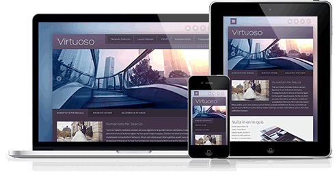
Small, medium, large. One website for all devices.
With Responsive Design, your website's layout is fluid. Regardless of whether the visitor is browsing on a desktop computer, tablet or smart phone, a responsive website will arrange its content seamlessly to fit the user's device.
As browsing habits evolve, more visitors are using mobile devices. A responsive design approach is essential to deliver a consistent customer experience, regardless of the device they are using. SoftBit Informatics create award winning responsive websites which have been recognised not only for their remarkable design but also their usability, accessibility and innovative functionality.
Why Responsive?
Every new website we create is built using responsive design. Here are some of the benefits.
Future Friendly
Responsively designed websites adapt to any screen size. This means your website will be display to its full potential on all devices, even those which don't exist yet.
Simplified Management
Websites serve the same content to all devices, eliminating the need to maintain a separate mobile version. When you update once, you update everywhere.
Cost Effective
With a single, central codebase, updates only need to be implemented once to be reflected across all devices, saving time and money.
Search Engine Optimised
Page links are consistent across all devices. This improves search engine optimisation and increases the visibility of your website in search results.